DESIGN process
This project is a research-driven design project: research narrows down design scope and problem statements. Then the prototypes were tested by 3-round design iterations, and user feedback was taken seriously as the preliminary evaluation of the effectiveness of our design.
DESIGN BACKGROUND
Design Objectives
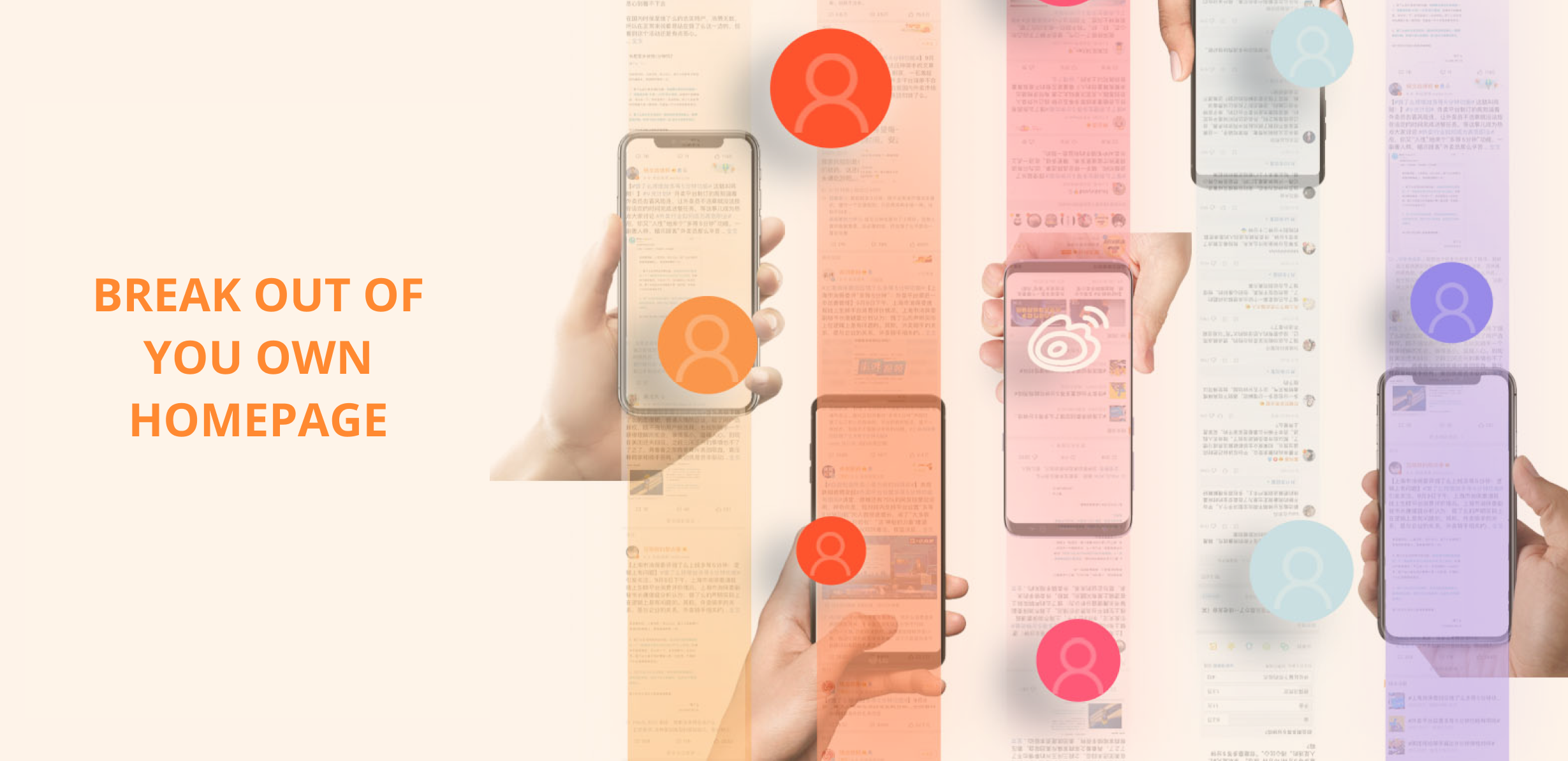
We picked Weibo as our study objective. It is one of China's biggest social media platforms, similar to Twitter, having over 445 million monthly active users. People prefer to use Weibo as the central platform to spread the news. Many fierce discussions, arguments, and online violence are derived from the news spreading, causing significant social influences.


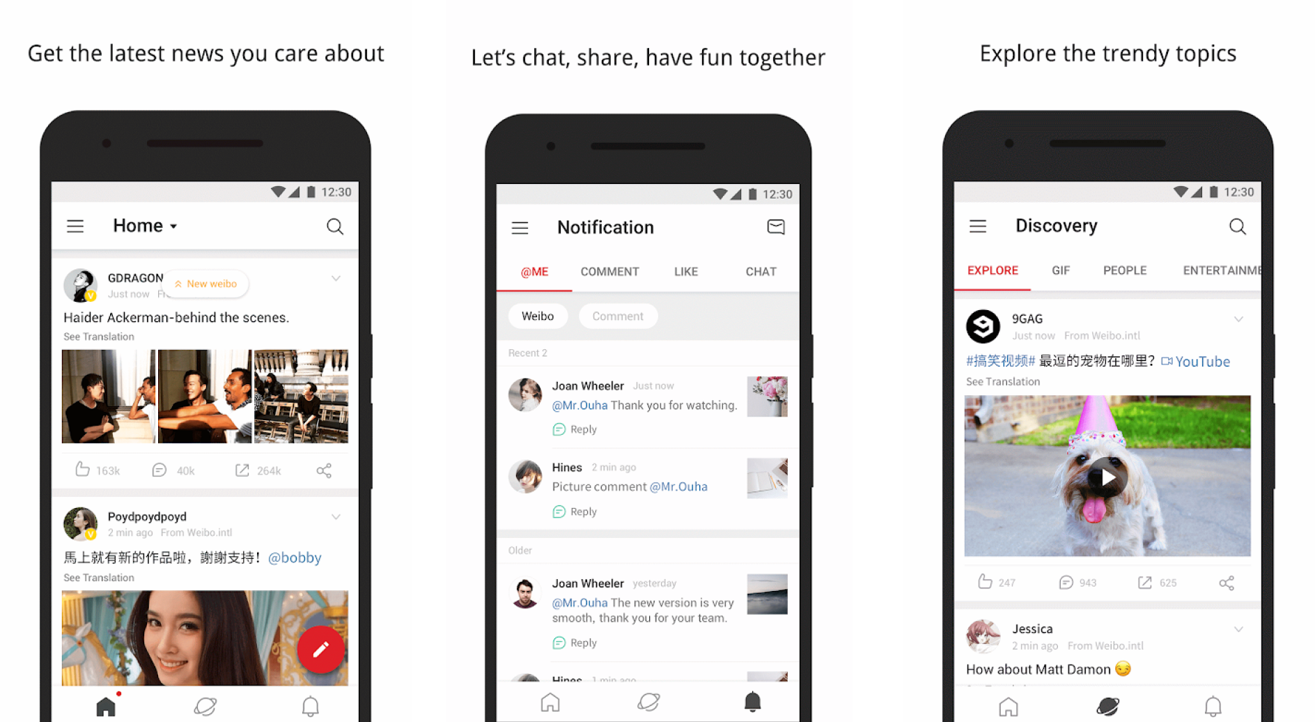
Main app interface
Original Weibo App Interface
Problem Statement
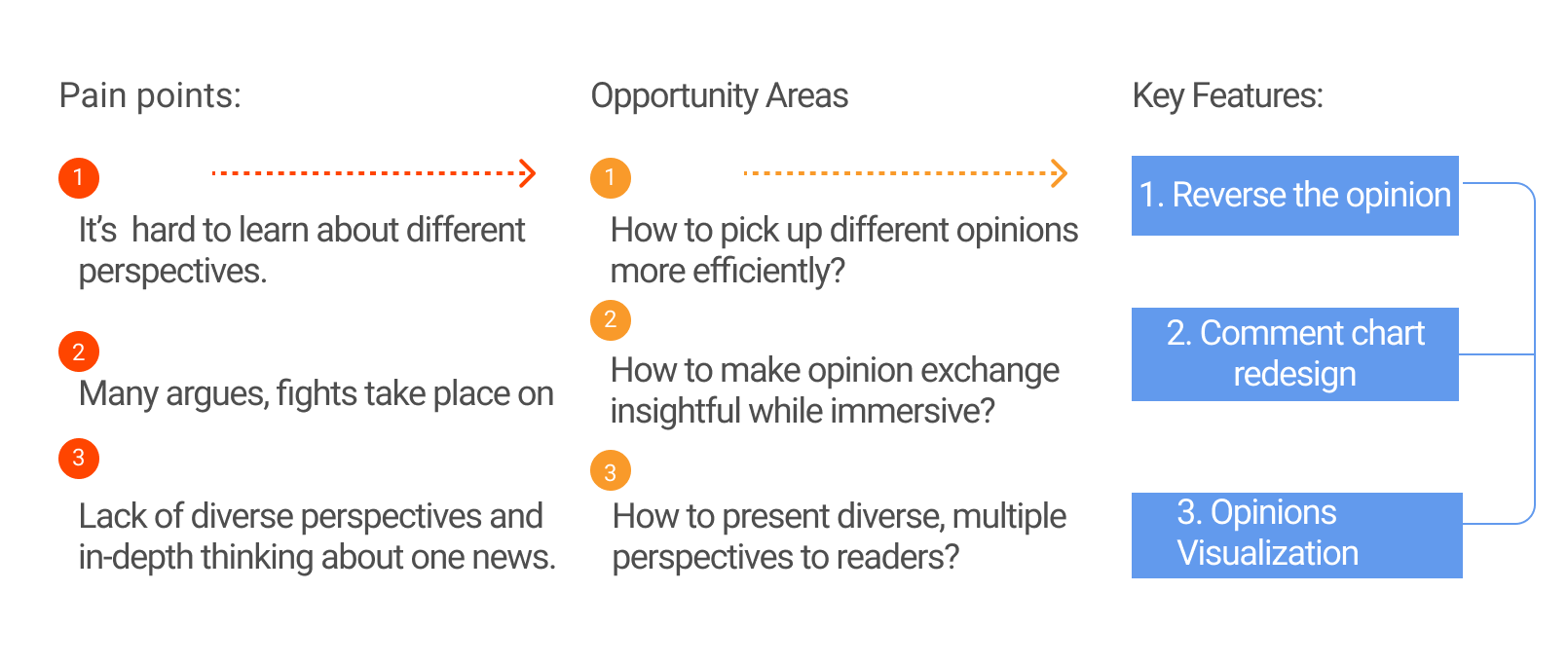
We break down the insights found in the research process and translate them into 2 ‘How Might We’ problems.
🔍 HMW1: help users embrace more different opinions?️
🔍 HMW1: help users embrace more different opinions?️
🔍HMW2: make the online discussion more peaceful
🔍HMW2: make the online discussion more peaceful
With a personal feeds automatically sent to users, users stay in their ‘comfort zone’, becoming less open to new perspectives. What can design do?
The internet seems like the place to go to get into fights. People feel free to express their thoughts on this virtual world, producing more conflicts. How to develop potential design interventions?
01 Research / Ideation/ Design
How do people use social media to get information?
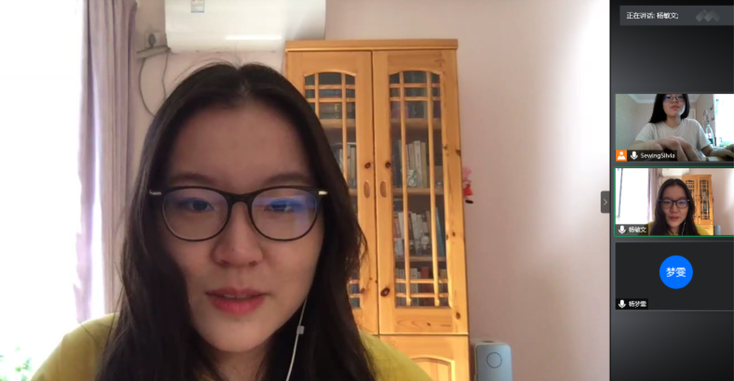
To answer this question, we did contextual research of social media information and interviewed 9 users to learn about their use of social media retrospectively.

User interview

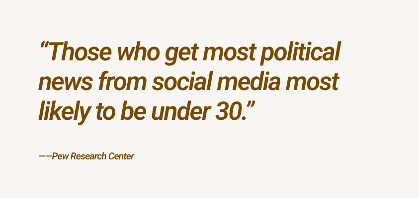
Based on literature research, we found out people under 30 heavily depend on social media news. We see young people using their phones and spending time on social media every day, but how do they digest information from different media, and how do they feel about it? These questions arouse our interests, and we believe it would be an excellent opportunity to create a potential impact. We performed 2 rounds of interviews and 1 round of focus groups with 22-30 years old and gained four valuable insights.
Insights
"Internet gives me fewer constraints about expressing."
- “I always feel free to express myself in the virtual space because no body knows me.”
"Online discussion atmosphere can be toxic."
- “I feel sometimes people get mean on the virtual space.”
- “Recently, there’s a young adult committed suicide because of the violent comments. It’s crazy....”
- “I become keep more thoughts to myself because I’m afraid of getting into fights.”
"I try to fight back the algorithm."
- “I don’t give feedback on my feeds, so the algorithm doesn’t know what I like or not, so it can’t only be personalized recommendations. ”
- “I try to follow influencers online that have different, even opposite points of view; it’s interesting to see how people think differently.”
"Online discussion atmosphere can be toxic."
- “It keeps providing me with similar news feeds.”
02 Research / Ideation/ Design
Concept Finalization
We brainstormed 10+ ideas in the first round. We developed three main features after group discussions and similar clustering ideas to address the problem statement.


03 Research / Ideation/ Design
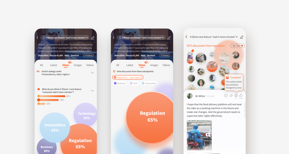
Design Proposals
We made prototypes and conducted the online test with the previous interviewees to test our initial design concept, generating 3 main pieces of feedback to improve our design. Insights we got from the tastings are. Help users embrace more different opinions?️


User Feedback 1: ‘‘Too much information clustered in one interface.’’
- There are avatars, comments, icons, etc. too many elements I don’t know where to start reading.
User Feedback 2: ‘‘Low contrast on color choice.’’
- Low contract makes it hard to read the words
I don’t know whether an element is clickable or not, there’s no hint!
User Feedback 3: ‘‘Hard to understand the new feature.’’
- This feature is interesting, but is very different from the original features that I get confused how to use it.
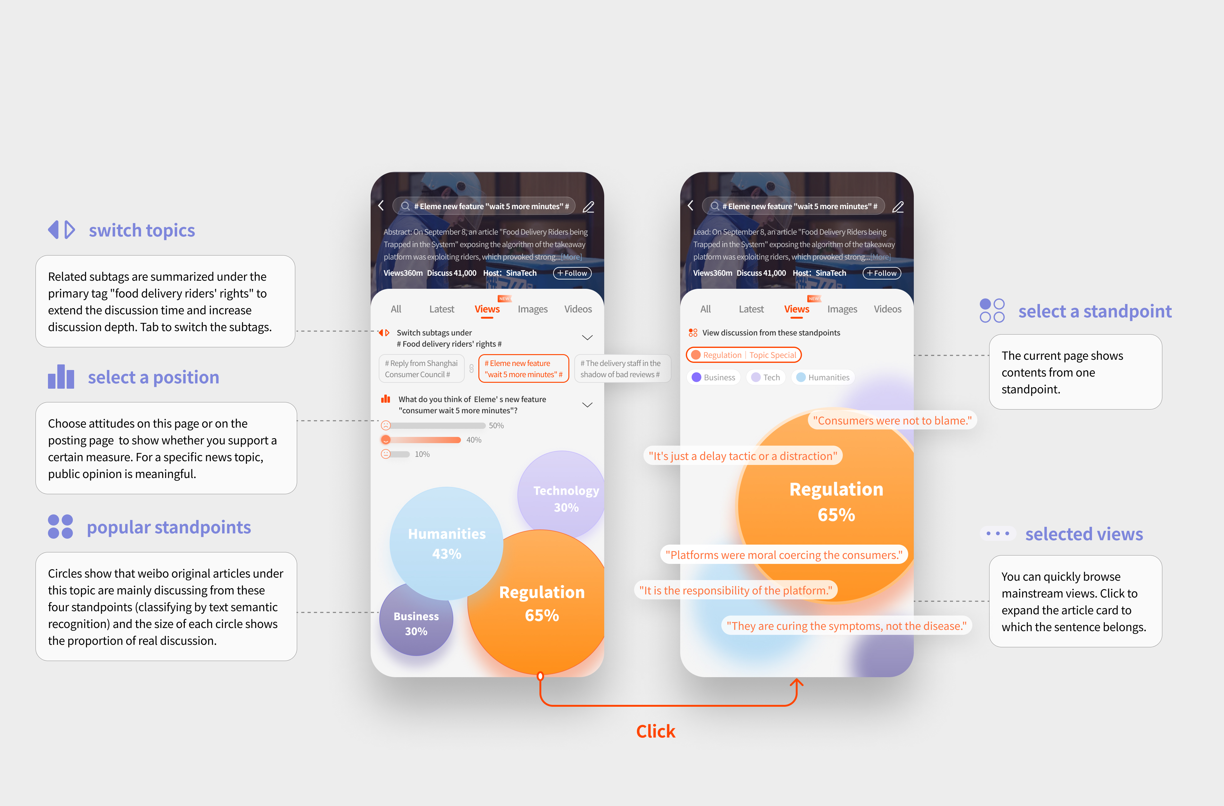
Design Proposal 1: Prioritize information
👨“Too many information clustered in one interface....”
Before: the style was unified, but users could not view the information.
After: categorize information into different priority

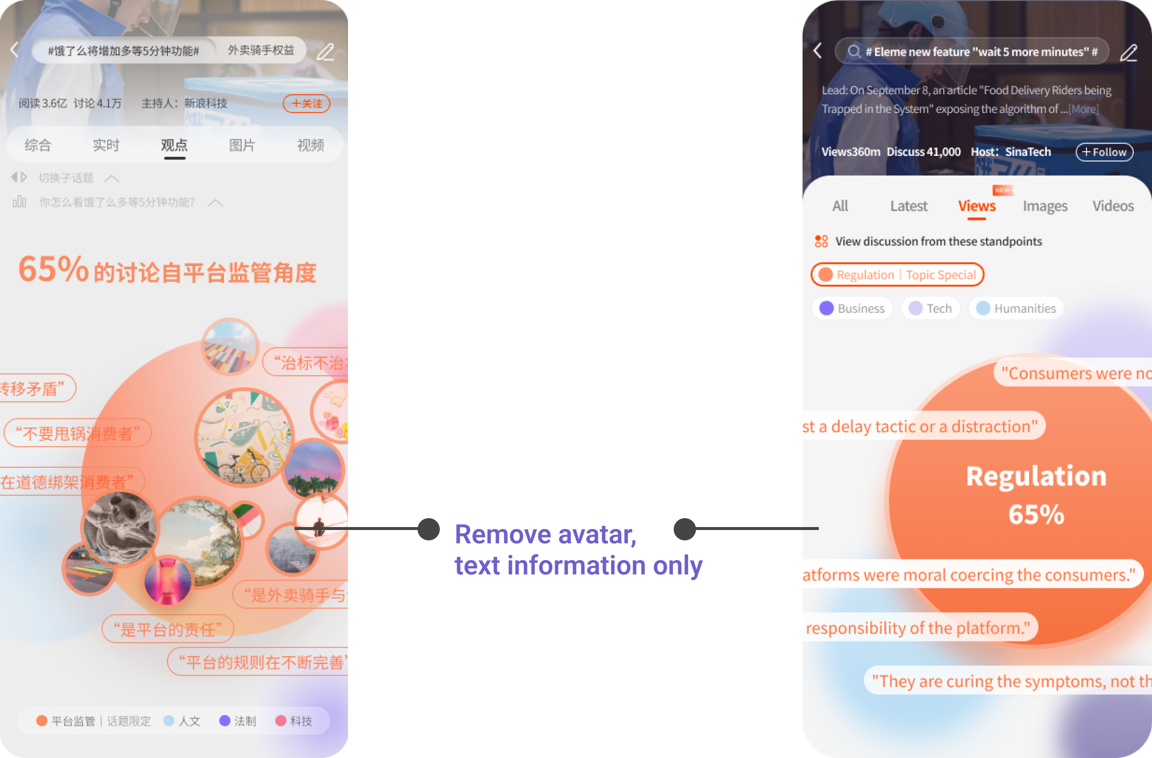
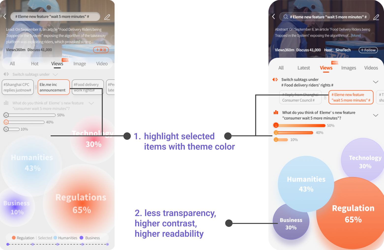
Design Proposal 2: Change theme color with higher contrast
👩“Low contrast on color choice, everything looks like a blur from far....”
Before: the style was unified, but users could not view the information.
After: change the theme color with higher contrast, making texts stand out.

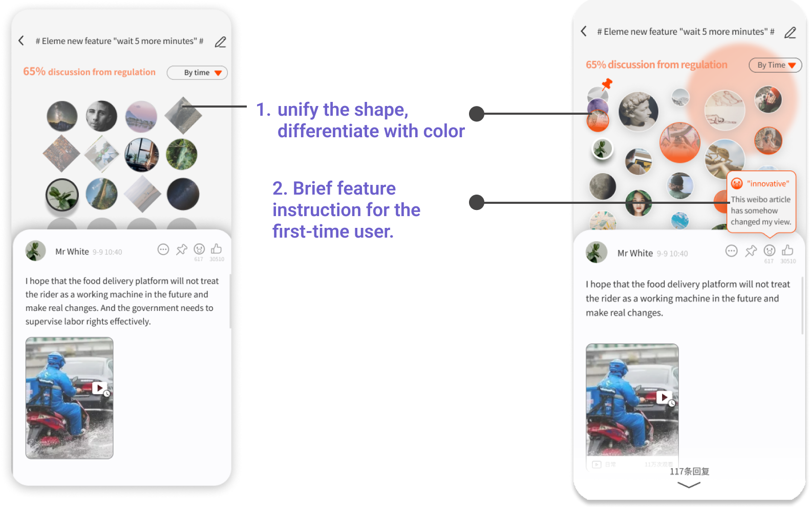
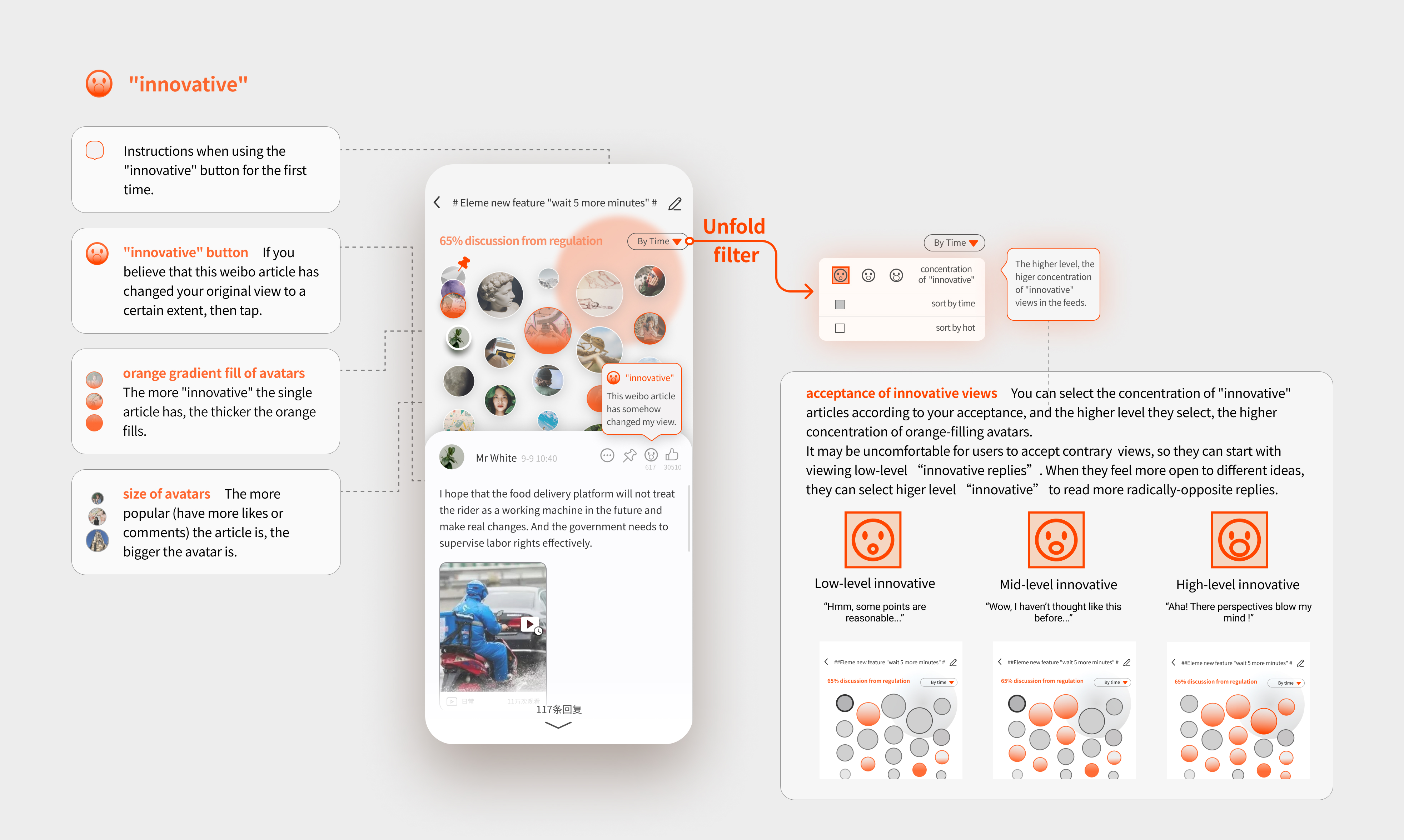
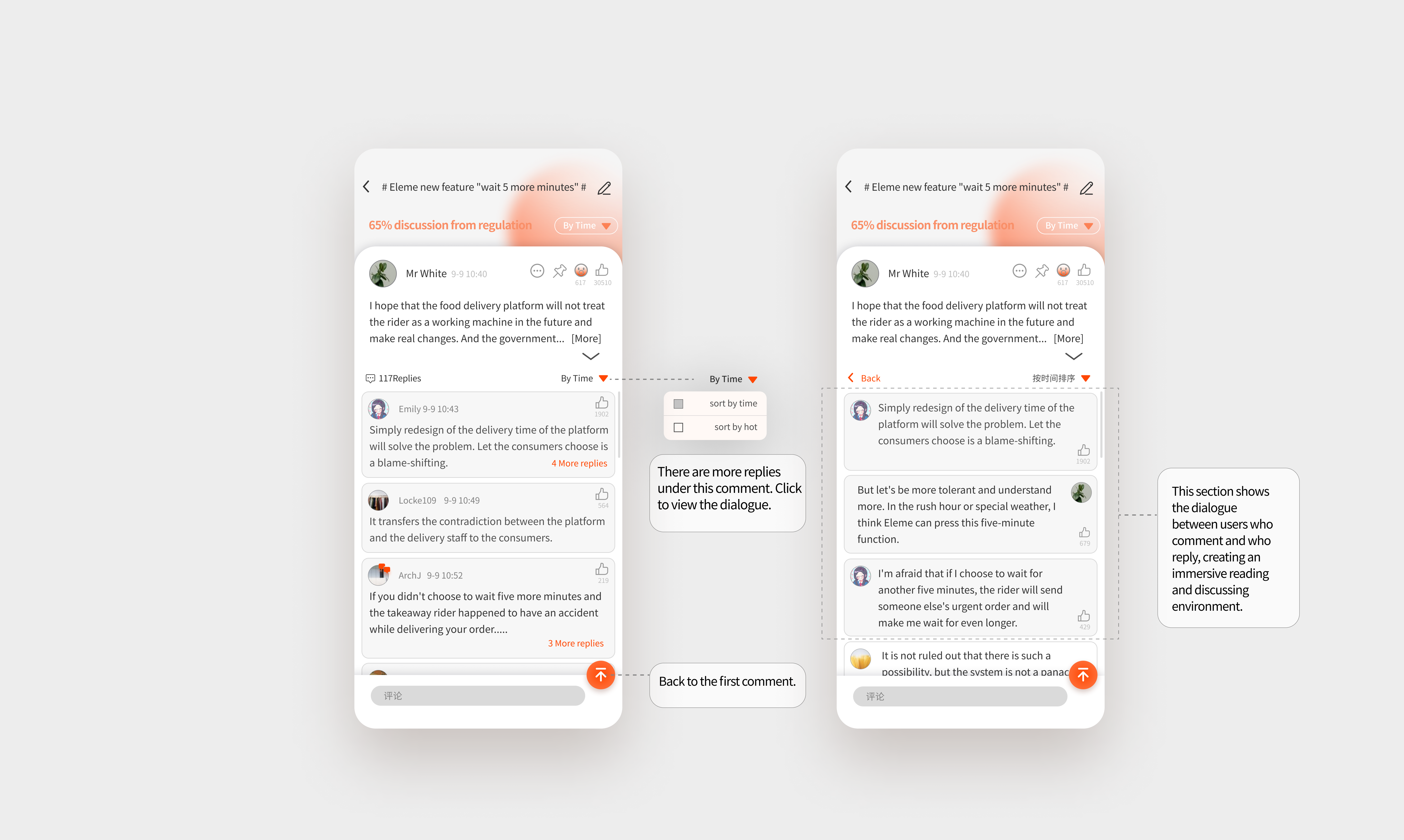
Design Proposal 3: Make new features easier to understand.
🧑“The new feature is hard to understand for the first-time user...It takes time to understand the rules."
Before: what do different shapes stand for?
After: change the theme color with higher contrast, making avatars orange to stand out.
